Minimal Wallet Icon Vector Set
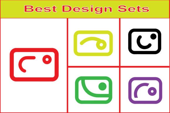
A well-chosen icon set doesn’t just decorate an interface—it supports clarity, reinforces trust, and quietly guides users through financial interactions. The Minimal Wallet Icon Vector Set is built for that purpose: a cohesive collection of 7 clean, rounded, intentionally restrained wallet-related symbols designed for real-world fintech and digital finance contexts. It’s not decorative clutter. It’s functional infrastructure—scalable, editable, and ready to integrate where precision matters.
Where This Set Fits in Your Workflow
Think of the Minimal Wallet Icon Vector Set as a pre-validated asset you bring into a project—not after design decisions are locked in, but early enough to influence consistency and reduce revision cycles. For UI/UX designers building a mobile banking prototype, these icons slot directly into Figma or Sketch libraries before component systems are finalized. For marketers launching a new payment gateway landing page, they replace generic stock illustrations with instantly recognizable, on-brand visual shorthand. For small business owners setting up a Shopify checkout flow or POS dashboard, they offer professional-grade assets without hiring a designer or wrestling with licensing restrictions.
This isn’t a “nice-to-have” add-on. It’s a time-saver at three critical points: planning (when defining UI language), building (when assembling screens or assets), and updating (when refining branding or adapting for new platforms). Because every icon is vector-based and delivered in EPS, SVG, PNG, and JPG formats, there’s no need to re-export or re-rasterize when scaling from a 16px status indicator to a full-width hero section graphic.
Compatibility That Works With Your Tools—Not Against Them
You don’t need to change your stack to use this set. It’s built to coexist. Adobe Illustrator users open the EPS files to edit paths, adjust stroke weights, or recolor using global swatches. Figma designers import SVGs directly—no plugins, no conversion—and drop them into auto-layout frames with consistent spacing. Photoshop users pull in high-res JPG or PNG variants for mockups, presentations, or printed pitch decks without pixelation. Even non-designers—freelancers updating WordPress sites or educators building course dashboards—can drag and drop PNGs into Canva, Google Slides, or Notion with predictable results.
The key advantage isn’t format variety alone—it’s interchangeability without compromise. An SVG used in a web app stays crisp on retina displays; the same EPS file opens cleanly in CorelDRAW for print-ready brochures; the JPG version embeds reliably in email templates where SVG support is limited. No guesswork. No fallback compromises.
Practical Integration Tips
- Start with naming and organization. Unzip the folder and rename each file using a clear, consistent convention—e.g., wallet-outline.svg, credit-card-filled.png. This pays off when searching across dozens of projects months later.
- Use SVGs for web interfaces—but optimize first. Run SVGs through tools like SVGO or Figma’s built-in export settings to remove unnecessary metadata. Smaller file size = faster load times, especially on financial pages where performance impacts conversion.
- Test color contrast early. These icons are minimal by design—thin strokes, subtle corners, light fills. Verify legibility against your background colors using WCAG-compliant contrast checkers, especially for accessibility-critical contexts like banking apps.
- Build reusable components, not one-offs. In Figma or Adobe XD, convert each SVG into a component with variants (e.g., “filled,” “outline,” “disabled”). That way, changing a single property updates all instances—no manual hunting.
Real-World Use Cases Across Roles
A freelance UX writer drafting microcopy for a neobank app uses the card icon alongside transaction labels—not just as decoration, but as visual anchors that help users scan and parse information faster. A small SaaS team launching a subscription dashboard imports the wallet icon into their React component library, pairing it with a tooltip explaining “linked payment methods.” A blogger creating a comparison guide for digital wallets uses the PNG versions in annotated screenshots—clear, neutral, and instantly legible even at reduced sizes.
Even educators teaching fintech fundamentals use these icons in slide decks to represent abstract concepts—“digital storage,” “payment authorization,” “multi-currency balance”—without relying on text-heavy diagrams. The minimal aesthetic avoids distracting from core ideas while maintaining visual coherence across lessons.
Quality Control and Long-Term Usability
Because each icon is fully vector-based and delivered in industry-standard formats, quality degradation isn’t a concern—even years later. You won’t hit resolution limits when exporting for a new device (e.g., foldable phones or large-format kiosks), nor will you need to re-purchase or re-license if your team expands or your platform evolves. There’s no vendor lock-in, no subscription fee, and no usage cap.
What does require attention is consistency of application. Minimalism only works when applied deliberately—not as a stylistic shortcut, but as part of a broader visual system. If you’re using these icons alongside other icon sets, audit stroke weights, corner radii, and visual weight. A mismatched icon can undermine perceived professionalism more than an ornate one ever could.
Also consider context sensitivity: the same wallet icon may signal “add payment method” on a signup form but “view balance” on a dashboard. Pair icons with clear, concise labels—especially for international audiences or users with cognitive differences. The Minimal Wallet Icon Vector Set supports that clarity; it doesn’t replace it.
Preparing for Smooth Implementation
Before dropping icons into a live project, take five minutes to audit your current design system. Ask: Do you already have wallet-related symbols? Are they consistent in style and function? If yes, decide whether to phase them out—or adapt the Minimal Wallet Icon Vector Set to match existing stroke weights and spacing. If starting fresh, use the included formats to build a lightweight icon library from day one: define sizing rules (e.g., 24px for toolbars, 48px for cards), establish color mapping (primary, secondary, disabled states), and document usage guidelines for teammates.
For teams using version control (like GitHub or Abstract), treat icon assets like code: commit changes with descriptive messages, tag major updates, and store source files (EPS/SVG) separately from exported derivatives (PNG/JPG). That preserves editability and makes collaboration transparent.
Finally, remember that minimal doesn’t mean minimal effort. These icons work best when paired with intentional layout, thoughtful typography, and accessible interaction patterns. They’re part of a system—not a standalone fix. Used thoughtfully, the Minimal Wallet Icon Vector Set becomes invisible in the best possible way: supporting understanding without drawing attention to itself.